FARADAY FUTURE
OVERVIEW
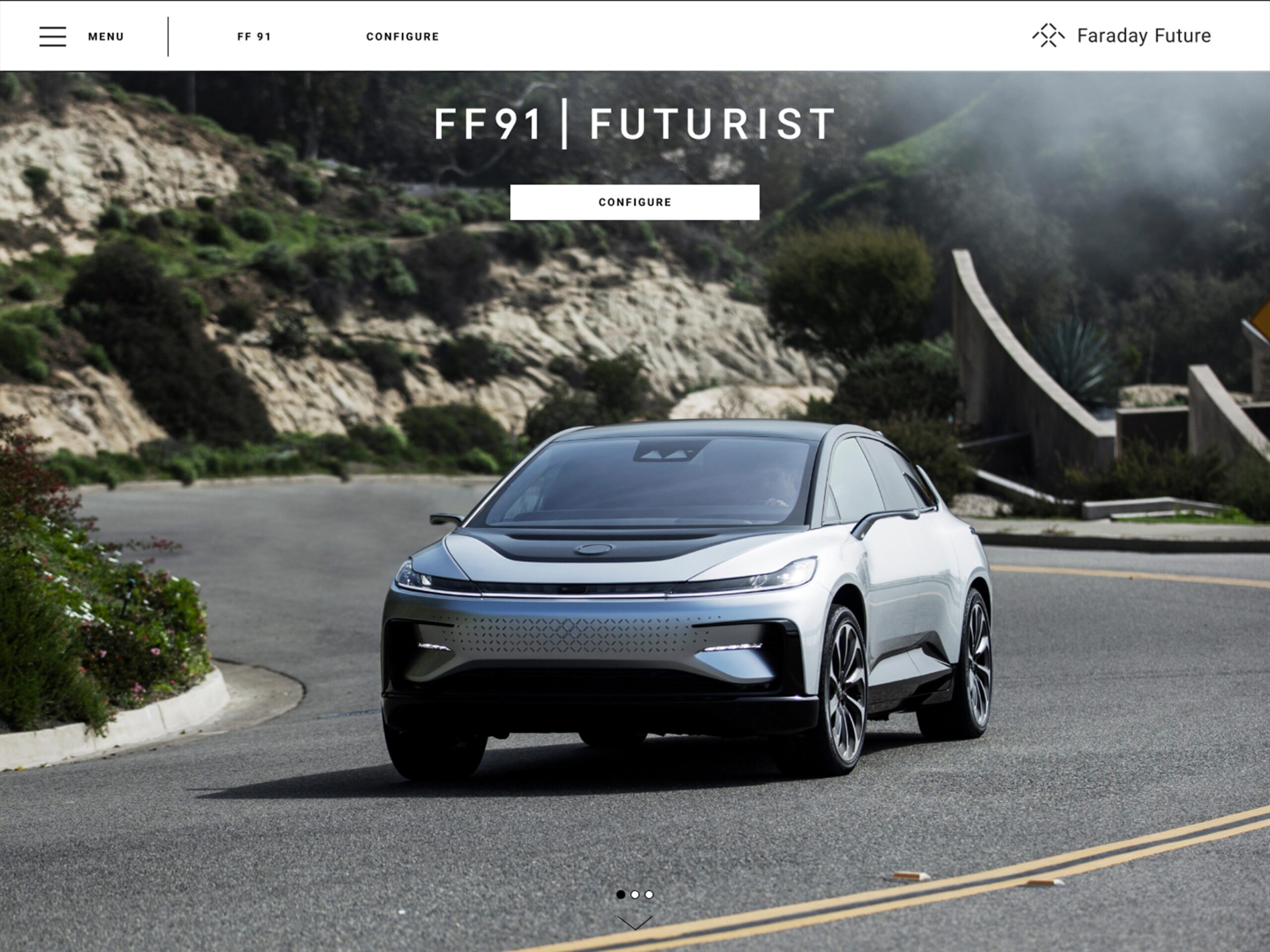
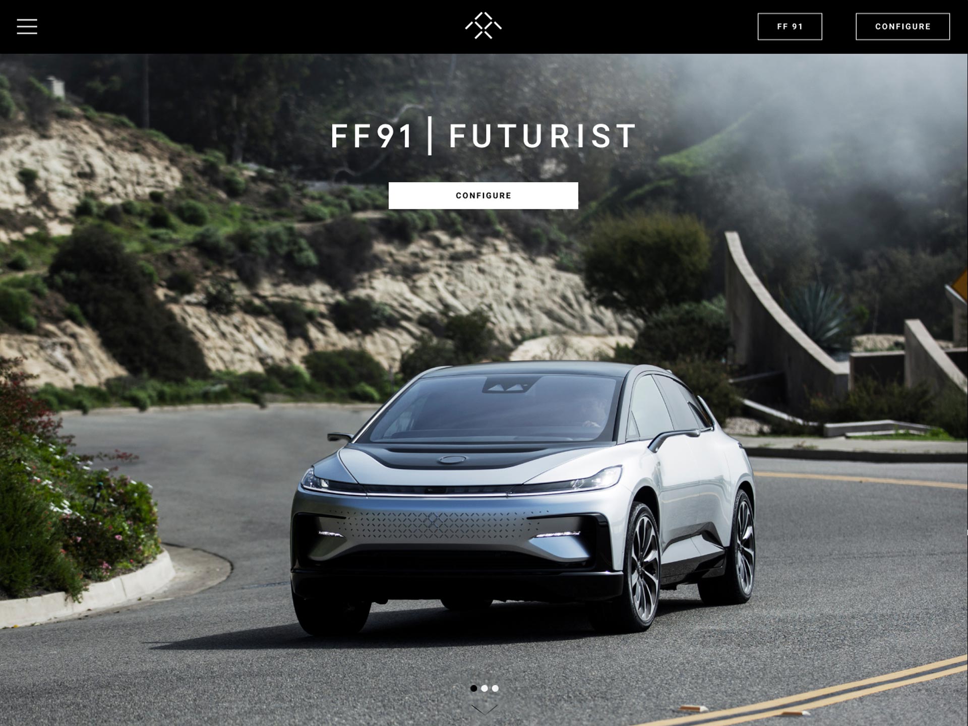
As the Sr. UX and UI Lead I updated the experience and overall look of FF.com. I was tasked to evaluate the existing and redesign the website to communicate the goals of the company clearer and improve user flows creating a clear pathway to find information and purchase the revolutionary FF 91.
Here’s how I established Faraday Future as a vibrant, high end, luxurious source of inspiration within the EV community.
WHAT I DID
• Design Research
• Competitive Analysis
• Digital Production
• Creative Concept Discovery
• Interactive Design and Prototyping
• Creative Direction
THE RESEARCH
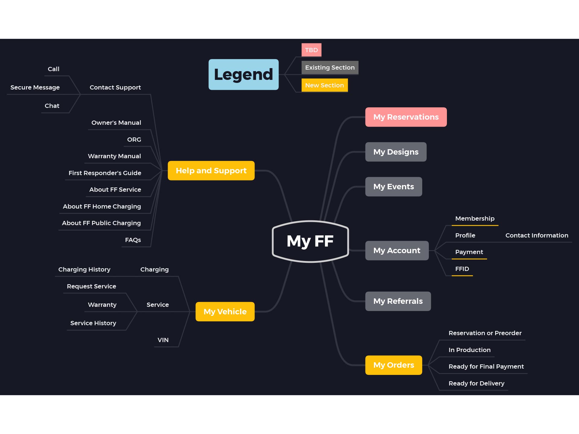
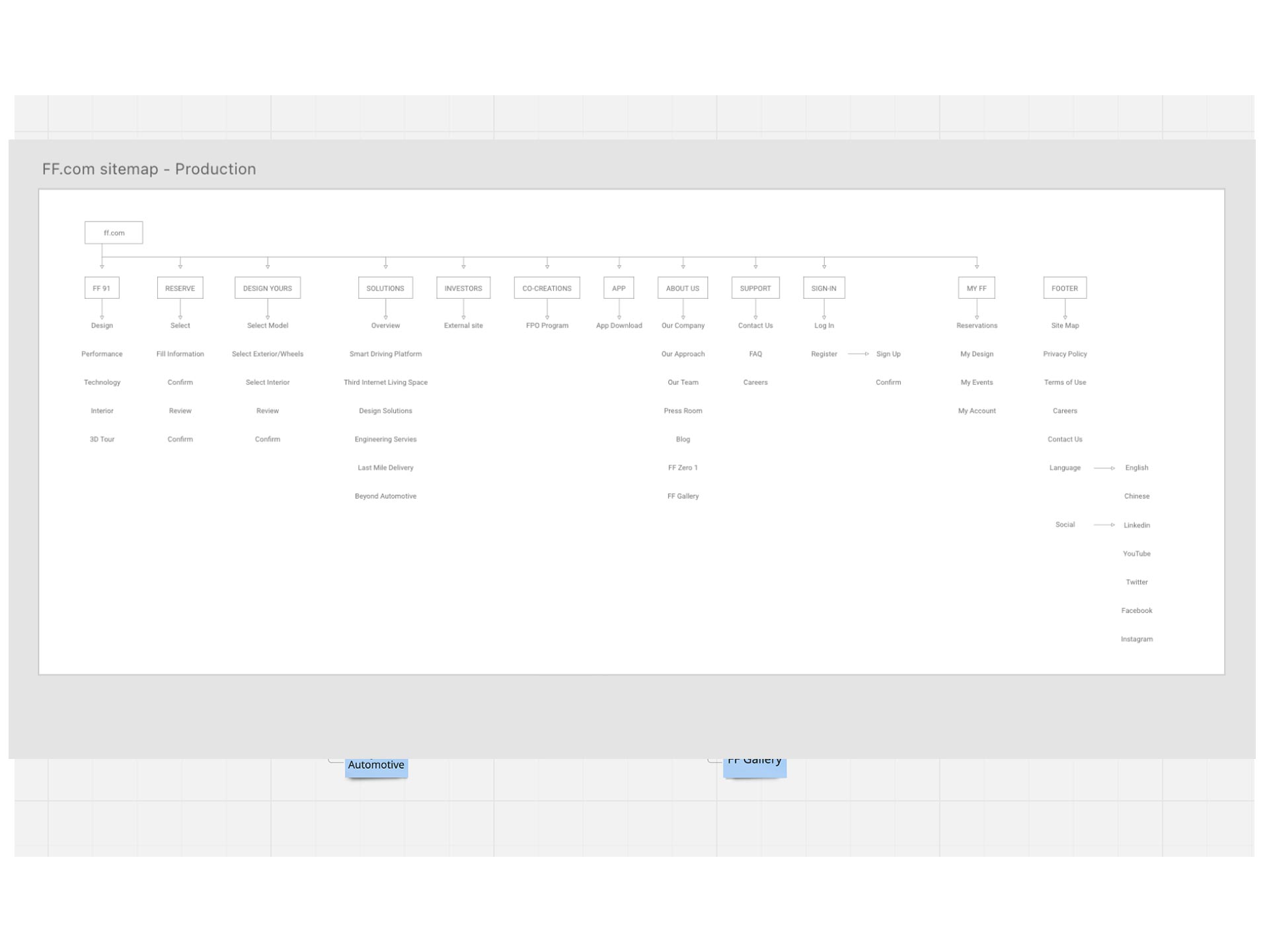
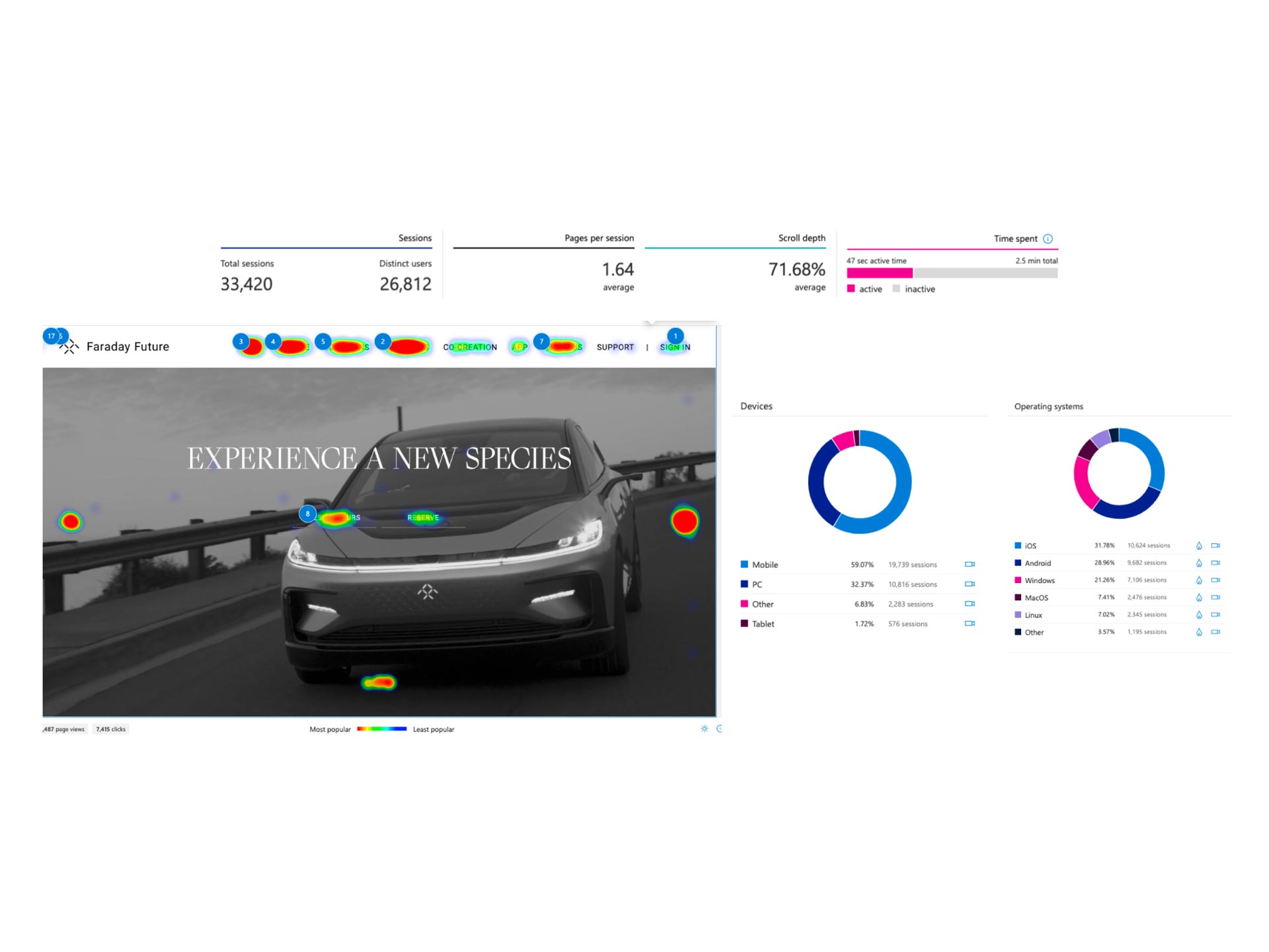
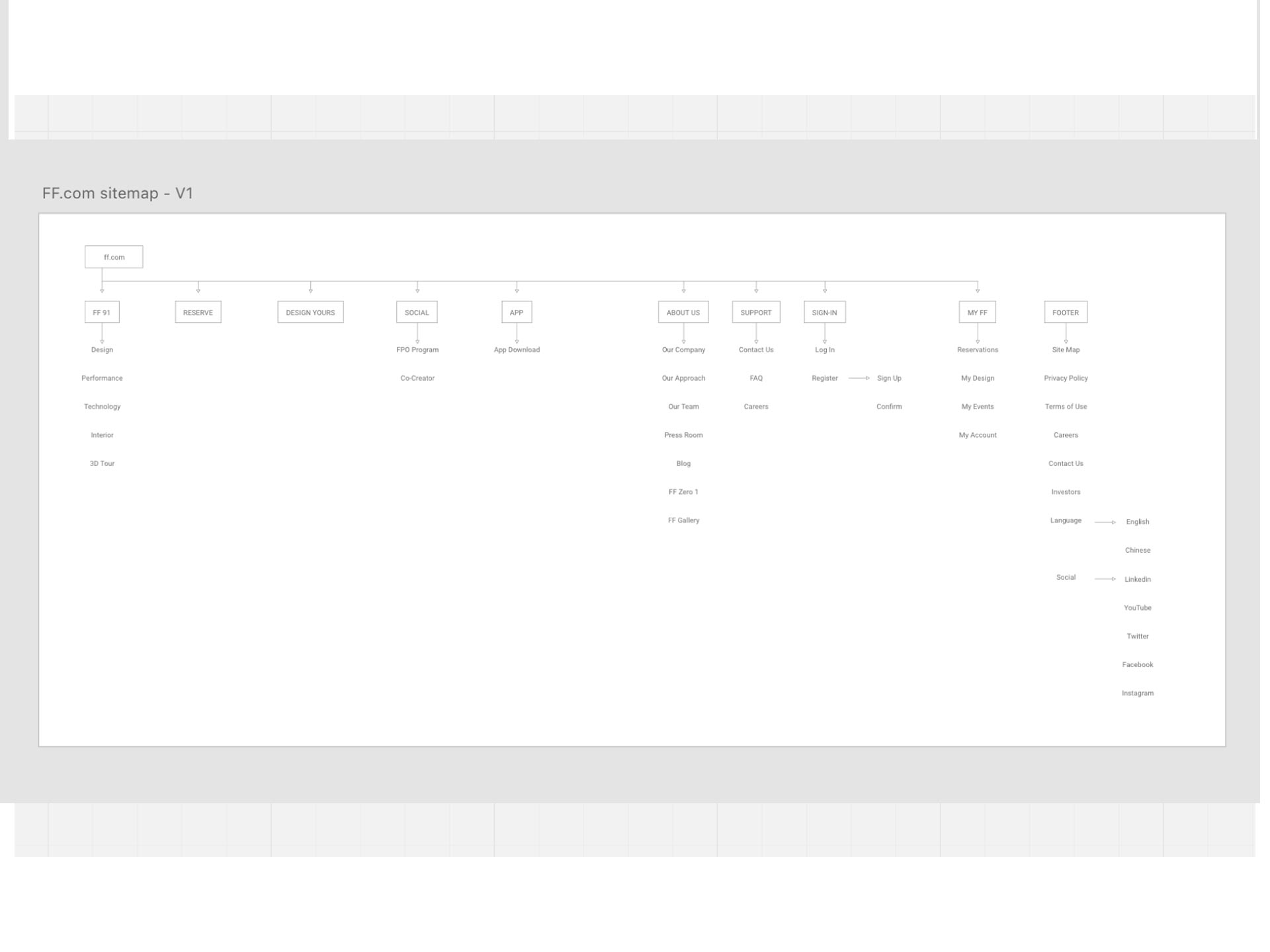
Upon my initial research phase, I observed high levels of traffic on three particular pages but lacking in all the others. Heatmaps and user surveys showed very little interested in anything other than the FF 91 car. I focused the refresh on these pages, placing them front and center, providing the user the information they were seeking. Alongside this refresh, new features were added to the website and an updated sitemap and user journeys was created.
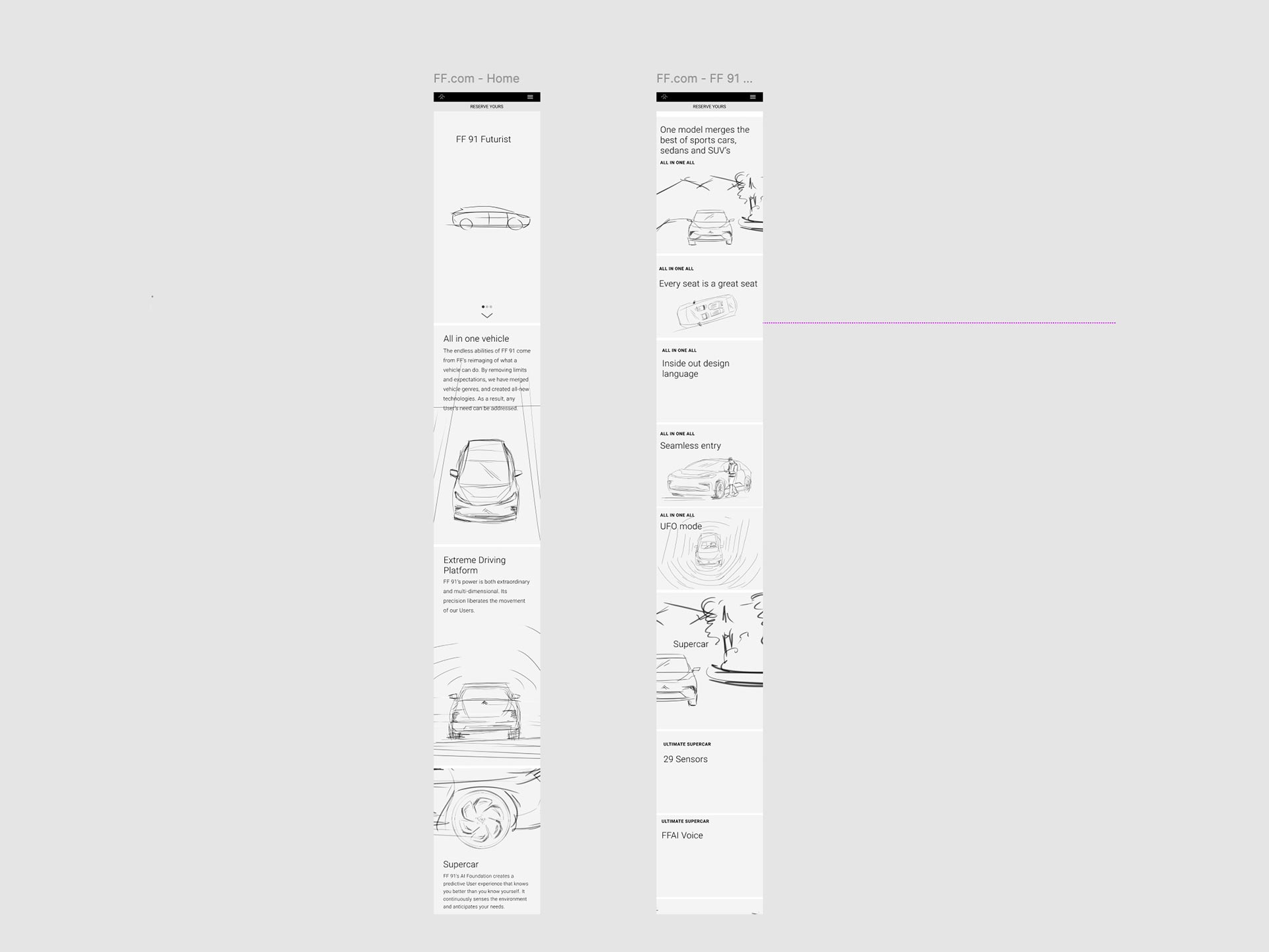
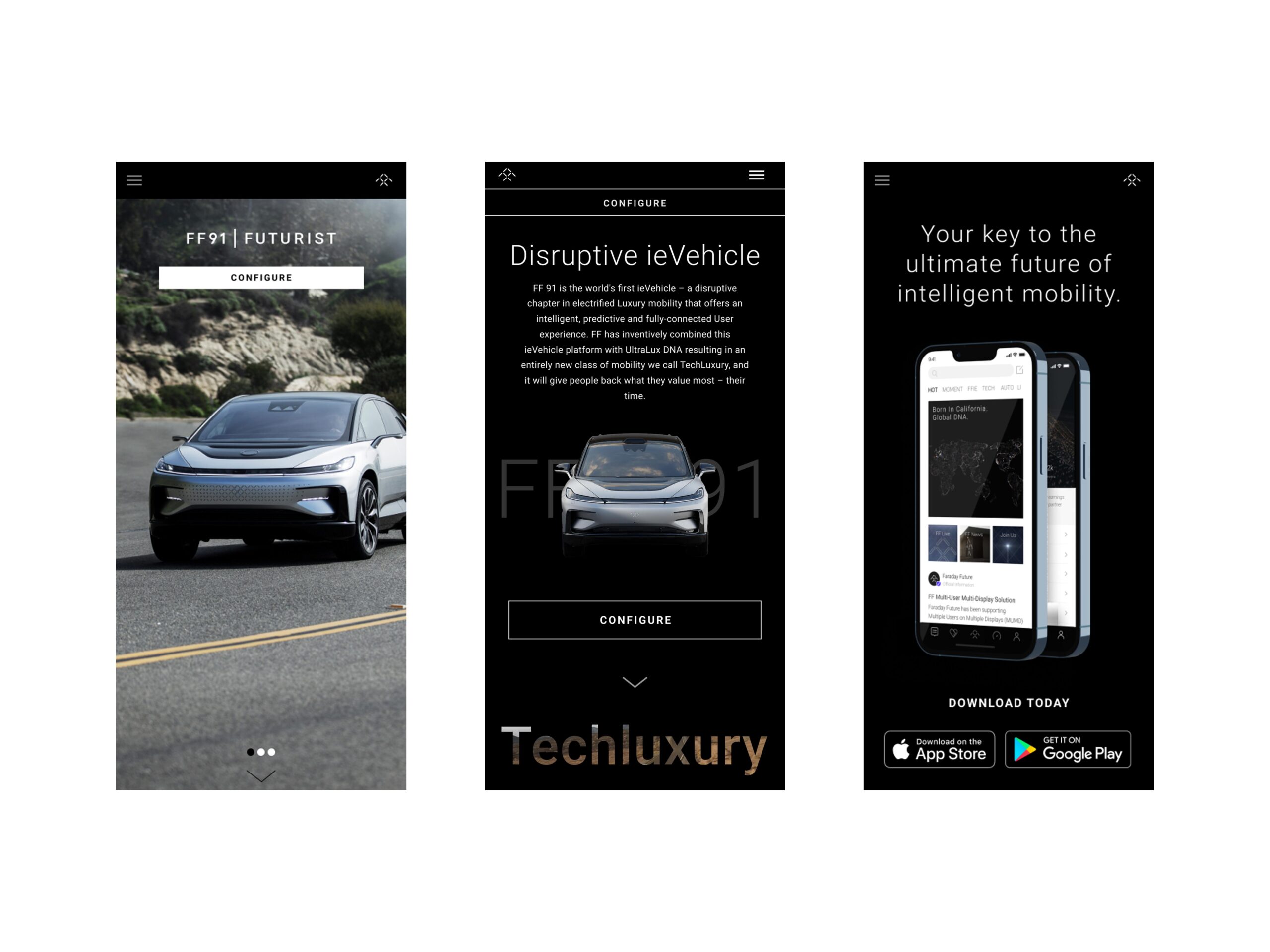
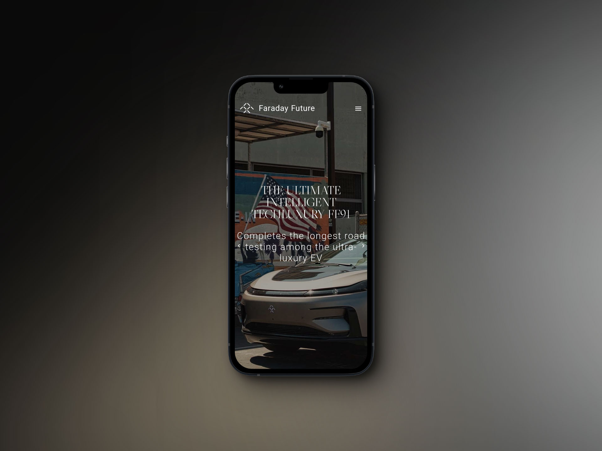
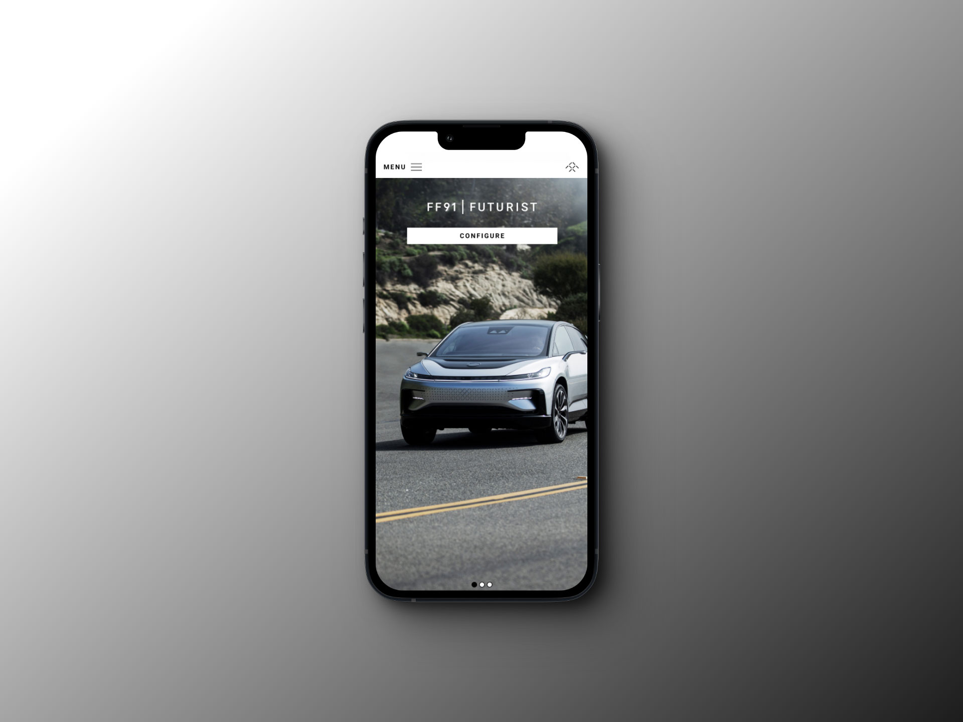
More than 60% of users were using their mobile devices to access the website, so I placed the mobile experience above any other.
THE PROBLEM
The original launch of the website was intended to excite people to the new company. A shift to people purchasing a car had to made. Mobile was broken and not optimized.
What the site was:
• Clean
• Simple
• Informative
THE SOLUTION
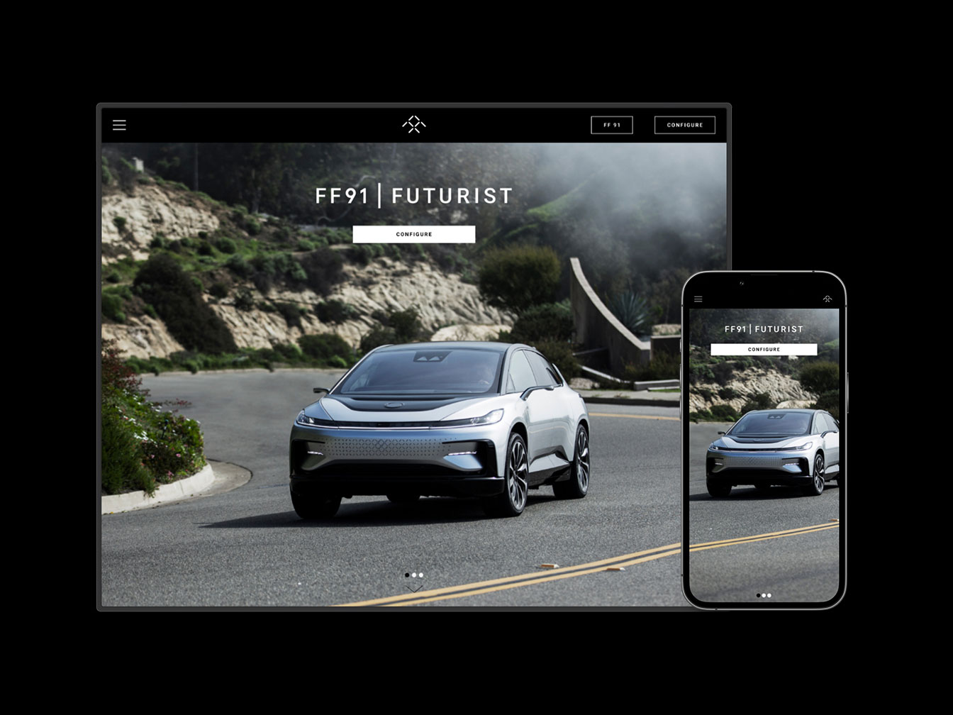
The website needed to re-excited and informed the user about the car and it's revolutionary technologies. The solution was a whole new redesign focused on purchasing and reserving the new FF91 in a simple flow. Educate the user with features and pricing options for the car in a easy and clear way. Putting mobile first and making sure assets and design scaled properly on all widths.
What the site was not:
• Clear Message
• No Call To Action
NEW FLOWS
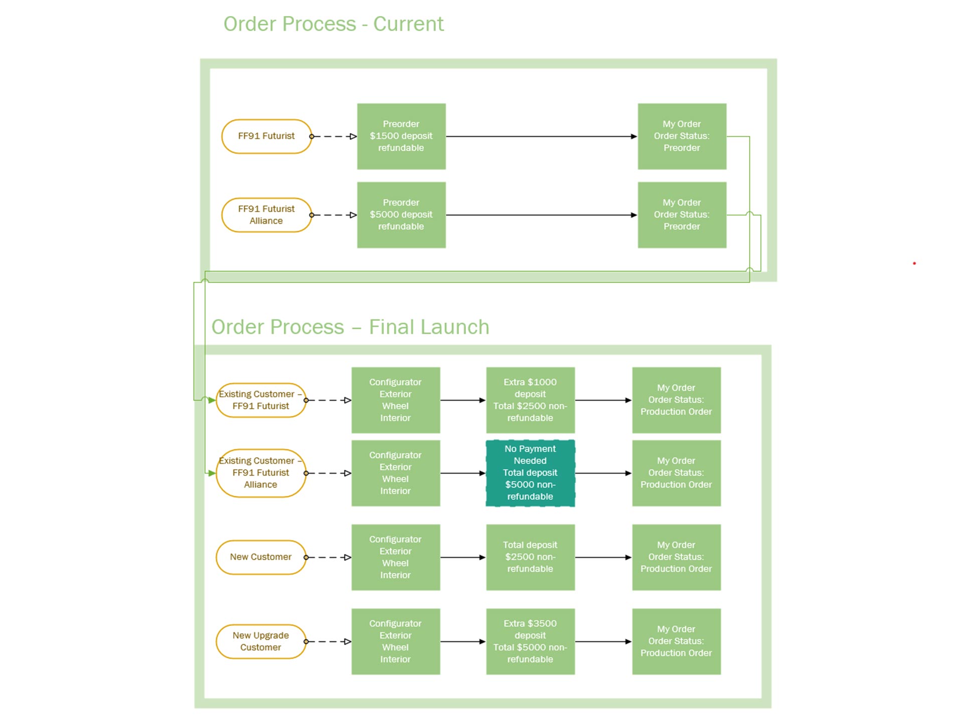
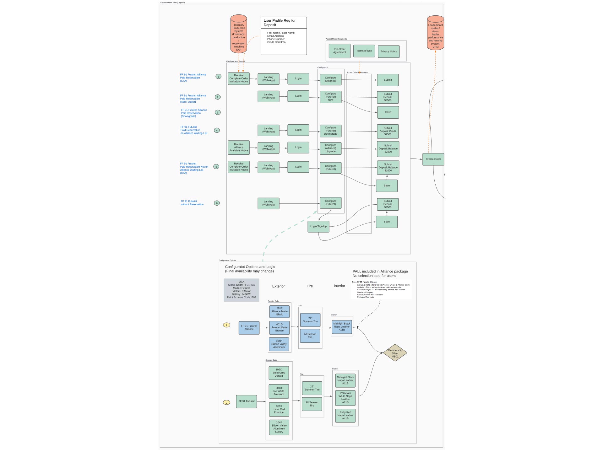
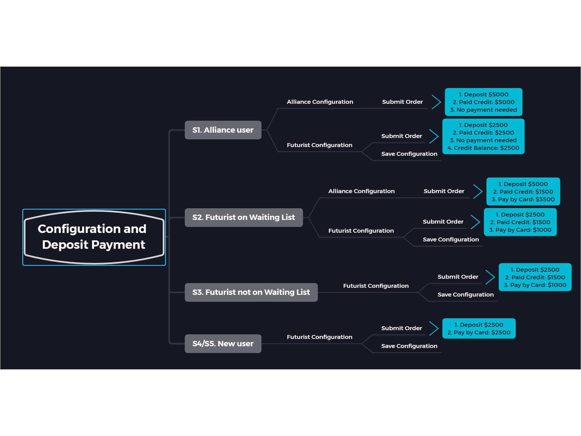
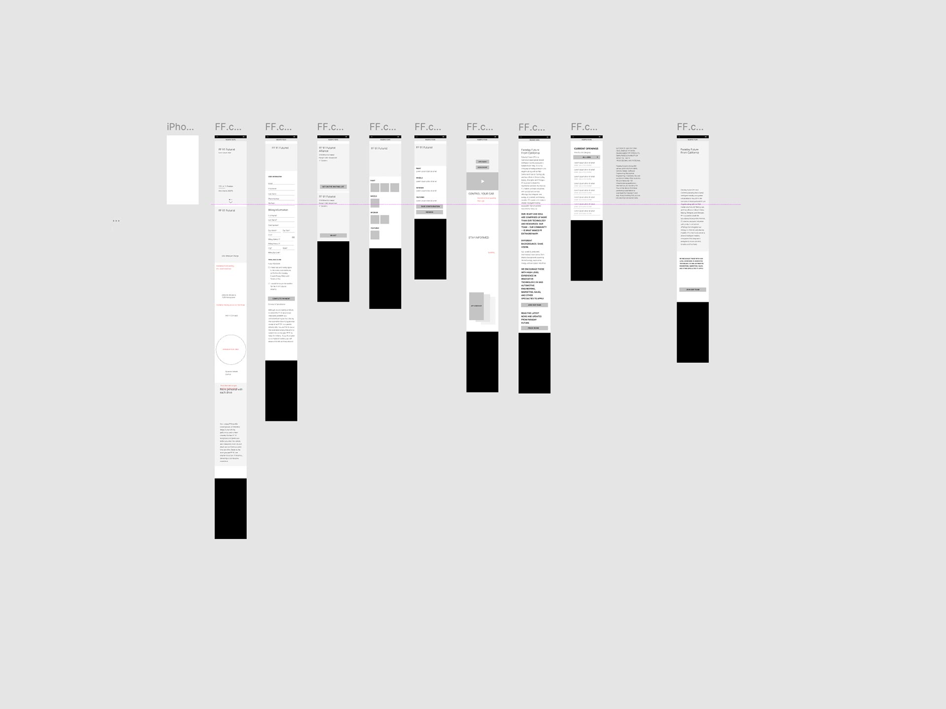
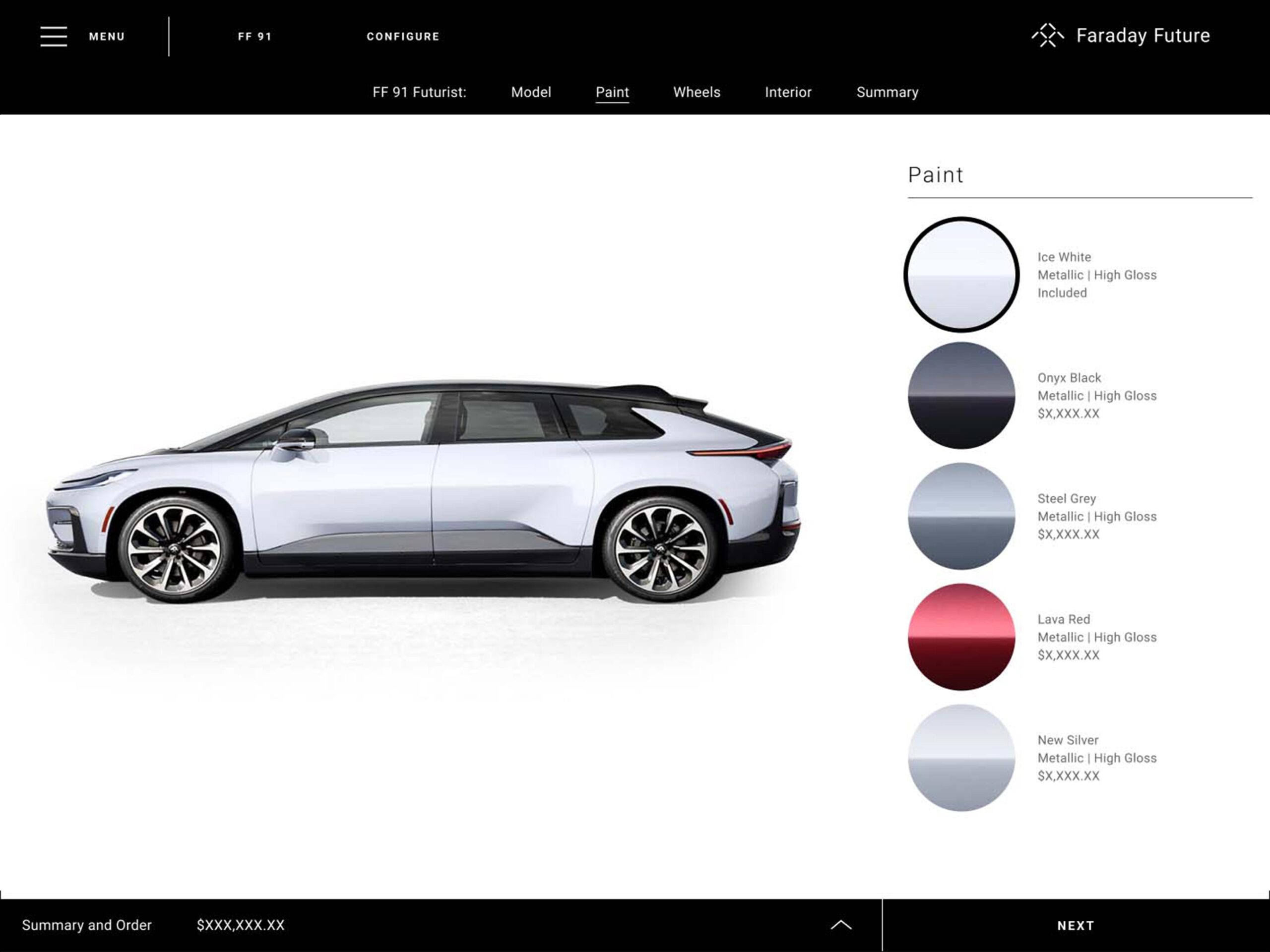
The next main step was to make sure the order, feature customization flow and check out process became was implemented. The previous process was just to reserve a car.
RE-ORDER
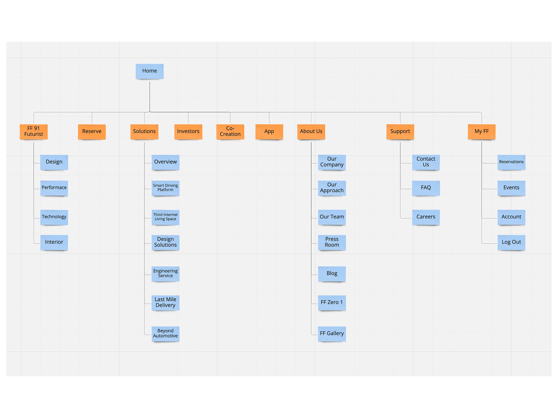
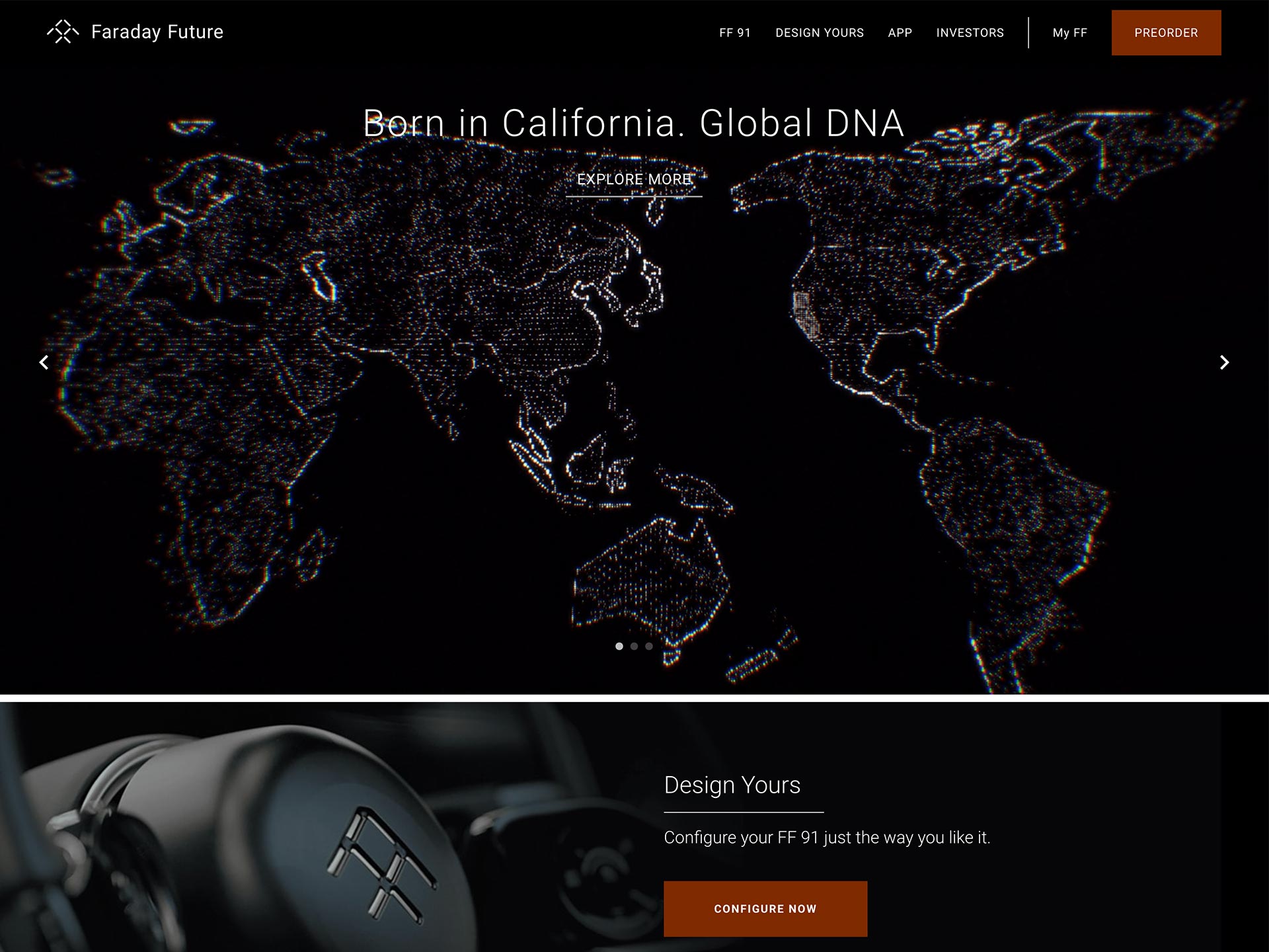
First I restructured the site architecture to create clear message instead of showing everything to the user.
We only needed a simple nav with 4 options to excite the user. We did a series of A/B testing to figure out exactly what users wanted to see and click on.
THE WORK
GOALS
The goal is to organize all the information from the past, gather the new and updated information and create simple flows for more complex features the company requires on the site.
ORGANIZATION
The original design and experience was intended to introduce the revolutionary FF 91 and educate the world about Faraday Future. It was a chance to show off its concept car, the FF Zero, and its capabilities as a company. It allowed for the user to pre-order the high end FF 91. Since then, the company has grown and is getting ready to launch the first FF 91 on to the road and with it a website refresh was needed to show consumers the new options and colors it will offer.
SCALIBILITY
Part of the new experience is being aligned more with the updated branding and colors, while there was a clear vision of branding, there was no clear digital vision. I proposed and managed a brand new digital design system that can be used for website, app and in car use. The FF Responsive Digital Design system was born out of necessity to make sure everything was cohesive and ADA compliant from the very beginning and the future.
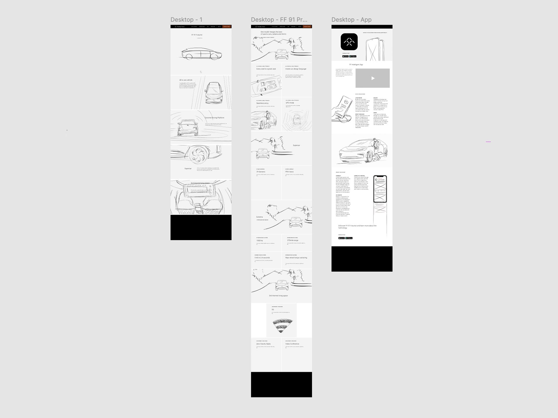
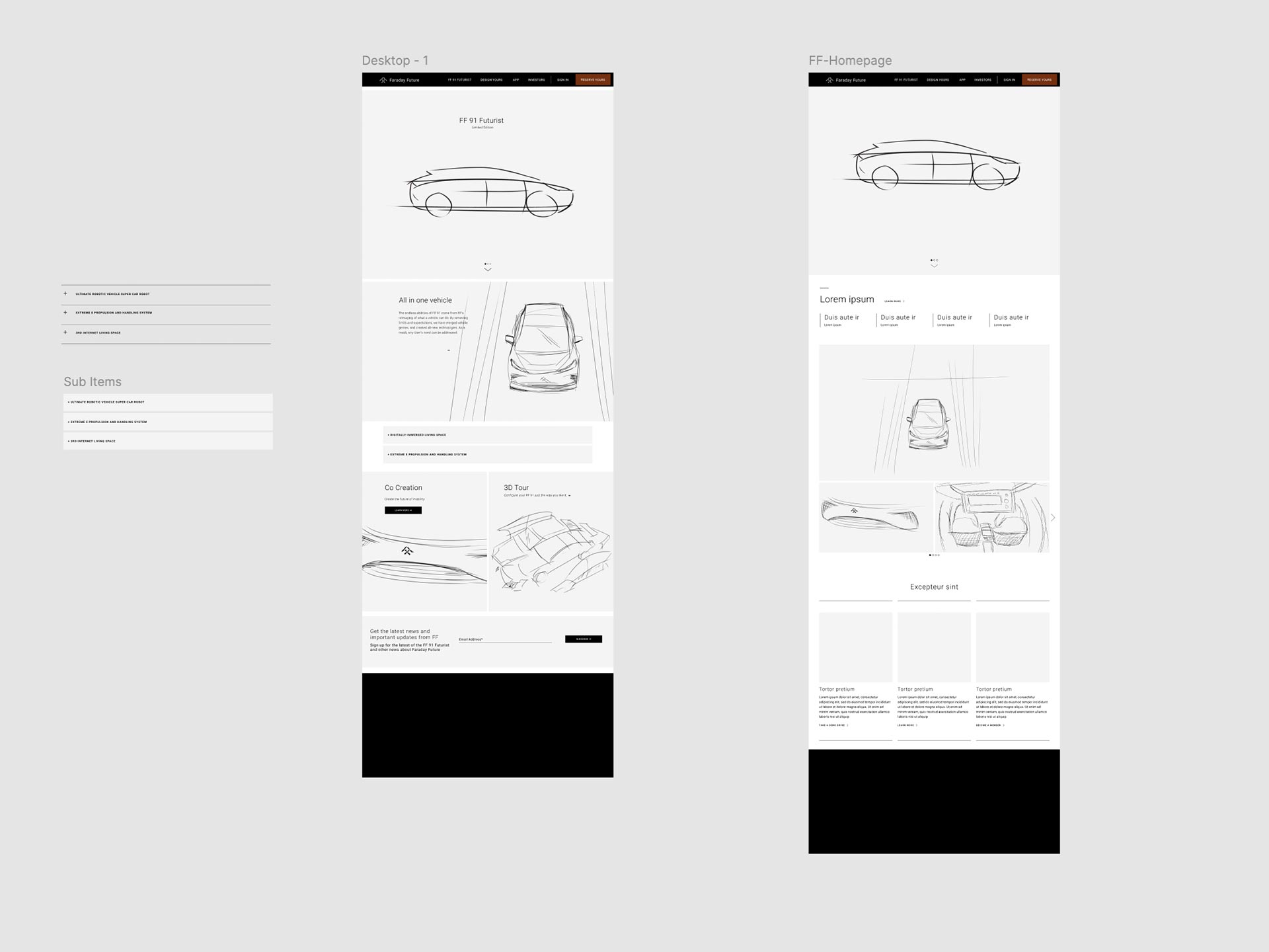
LO-FI WIREFRAMES
IX EXPLORATION
FINAL UI
THE LAUNCH
With several user testing and A/B testing I helped Faraday improve their overall user experience, created a online design system that was scalable and ADA compliant. Improved and created new flows for users that want to purchase the FF91 EV. I was proud of the experience that not only delivers upon the goals of the company but also gave a clear digital precense by aligning all the platforms from web to mobile to in car.
Reach Out!
2025 © Edition
