CWTV UNIVERSAL APP
Established a cohesive app that integrated a user centric experience. conversion of two applications with very different goals spearheading their success.
OVERVIEW
As the Sr. UX and UI lead I was tasked with another big leap for the CW Digital team. To unify the already redesigned CW Seed and CWTV apps into one.
This is how I combined two apps into one universal app to continue providing amazing tv shows and movies for free as one of few networks providing free content to it's users
WHAT I DID
• Design Research
• Competitive Analysis
• Digital Production
• UX/UI Team Managing
• Creative Concept Discovery
• Interactive Design and Prototyping
• Creative Direction
THE RESEARCH
I learned that consumers love specific shows and use the apps to dive into one or two. Viewers don’t want to watch the latest episode based off of the broadcasting schedule, rather they prefer to go into the show and make that selection themselves. This is where we focused our efforts.
CHALLENGE:
To successfully migrate existing audiences to a combined platform?
With a growing library how do I get users to easily navigate shows and movies to watch without them being frustrated.
SOLUTION:
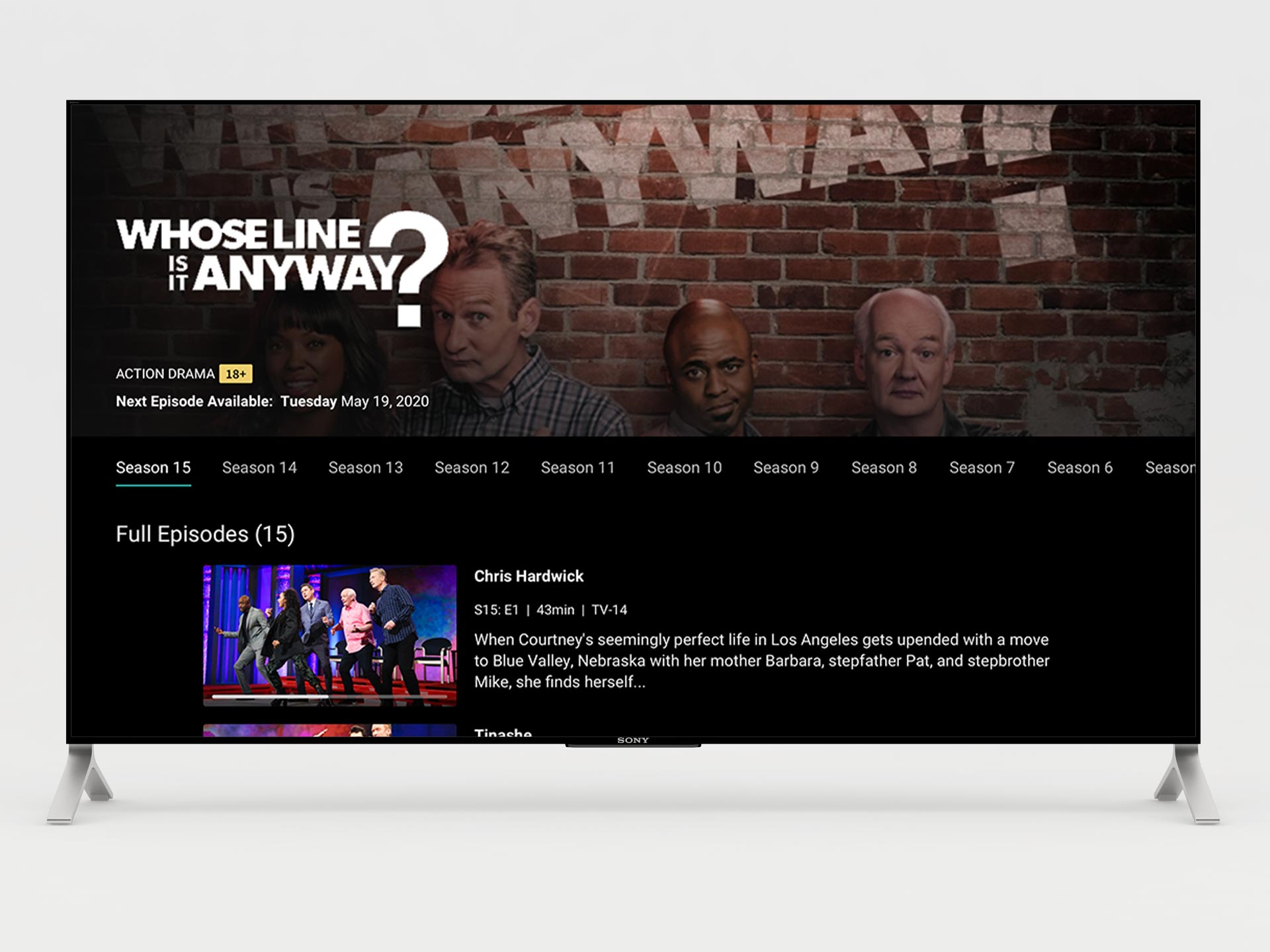
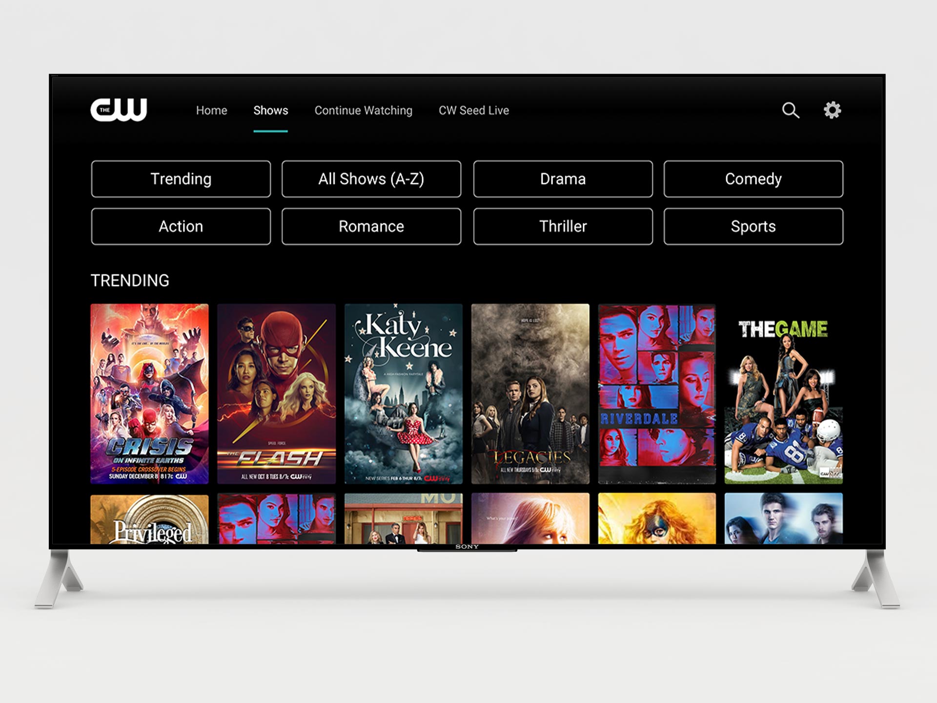
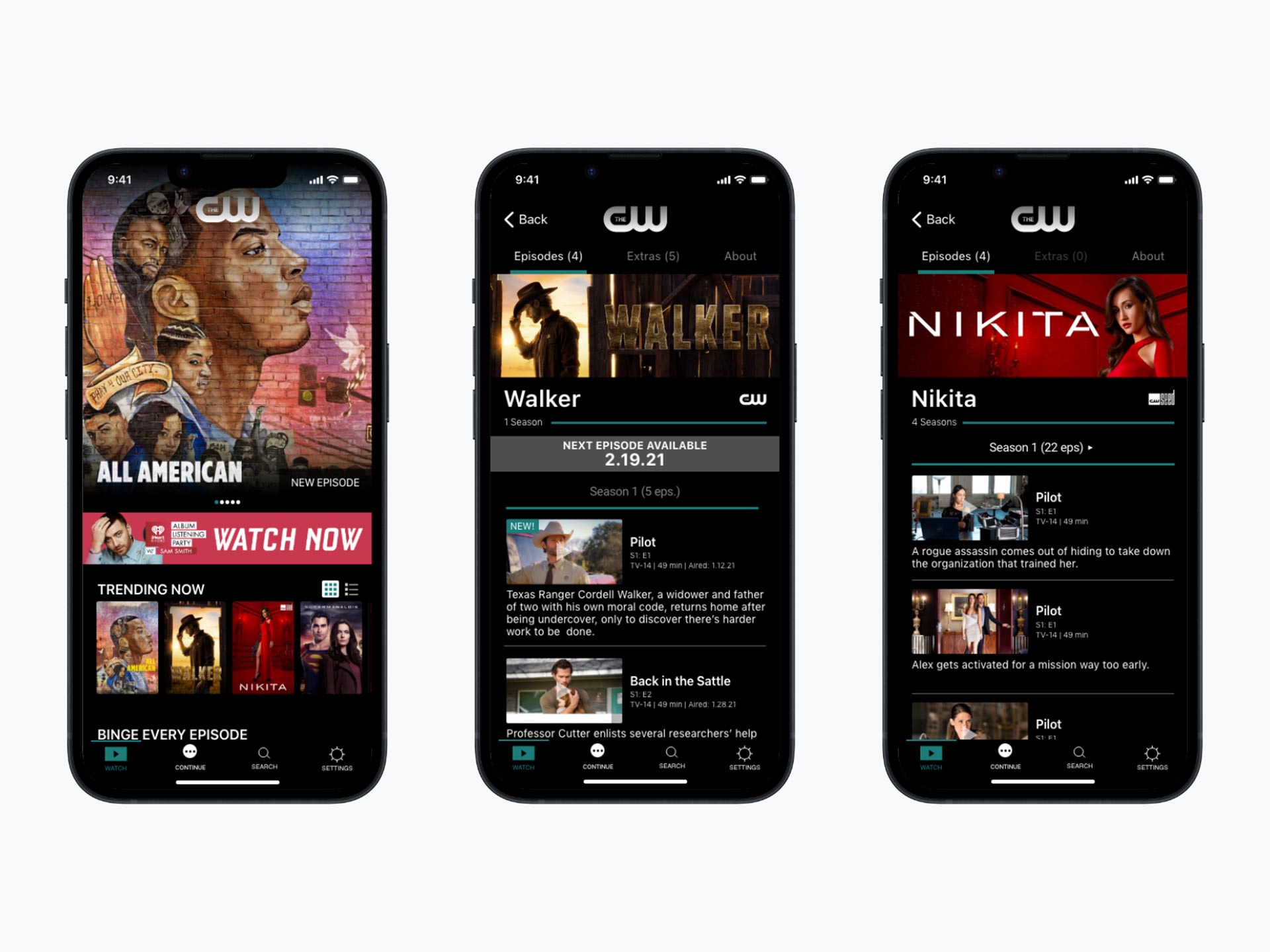
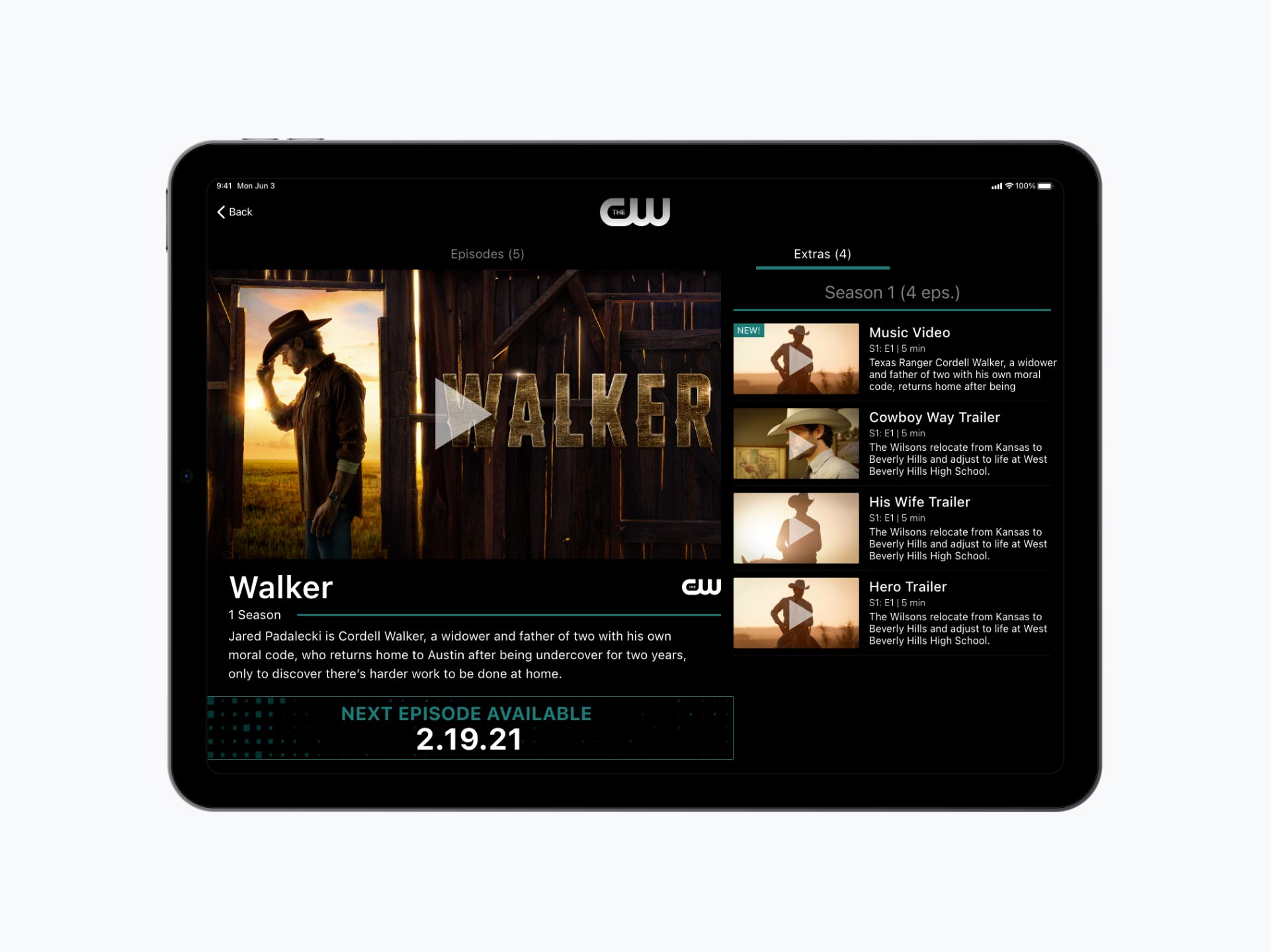
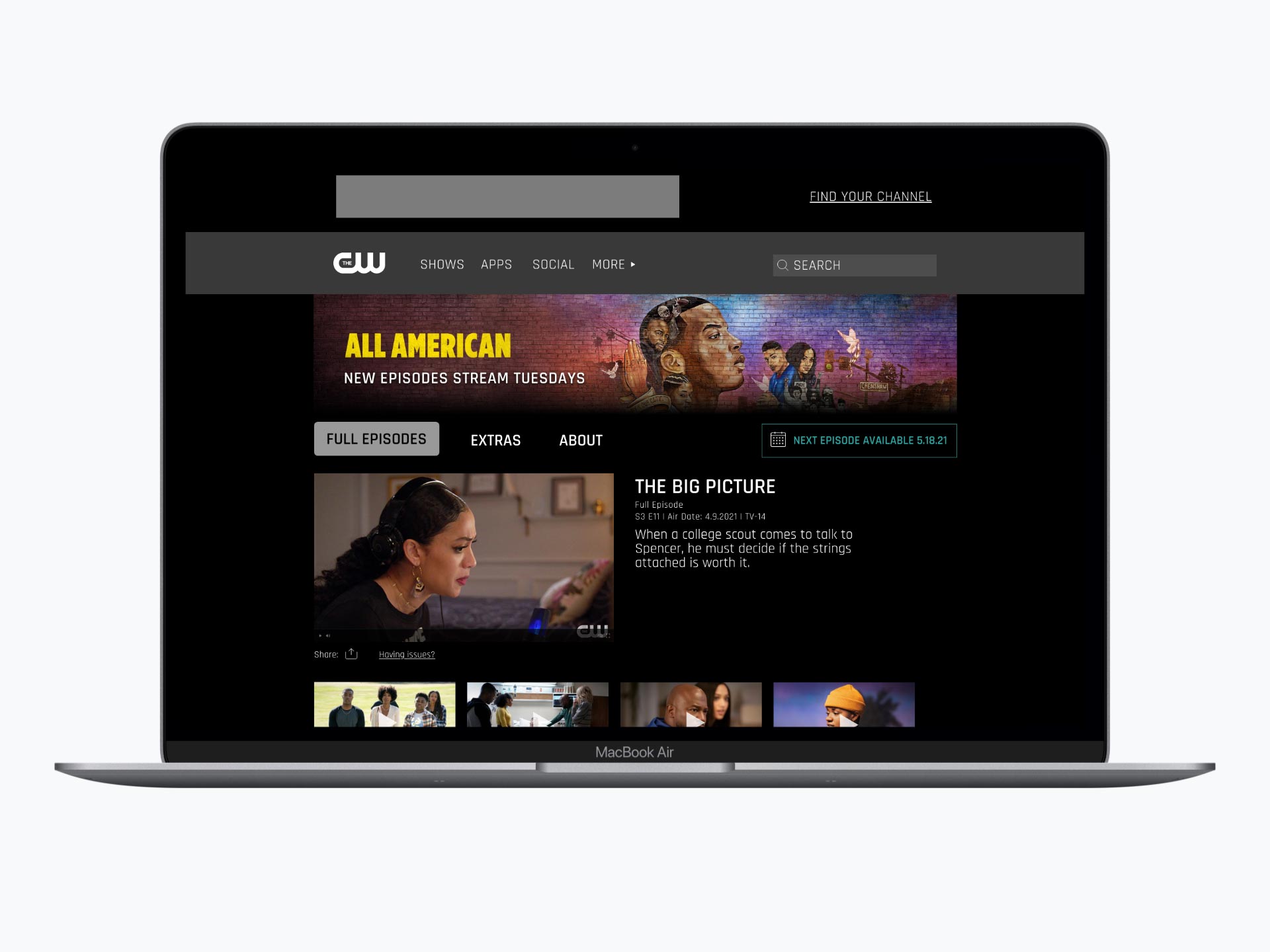
Create an experience that a user can navigate easily with categories or text lists of shows, create a show page that can be templated to have a show with multiple episodes or seasons. Finally, assist users to discoverability of new shows and movies.
THE OLD CW APPS


BASIC USER EXPERIENCE FLOW
With discovery at the forefront I focused on getting viewership to more shows and capturing the audience to continue watching. Provided with two unique apps, CW Seed and The CW Network, the spotlight was to encourage exploration which led to updating the user flow.

WHOSE WATCHING
The CW is a great network for anyone and everyone. They have a great group of viewers that range age and gender. It's something that the network loves to show off and makes sure people know.

ENGAGEMENT
The data we got about the use of the app was the majority of people would watch in chunks, this was key to make sure we had a "Continue" section easily available instead of it being a carousel like other streaming apps do.

UPDATED SITEMAP
Having an updated sitemap was important because it further organized the feature roadmap and try to design for the scale. This helped me understand where I would place each feature.

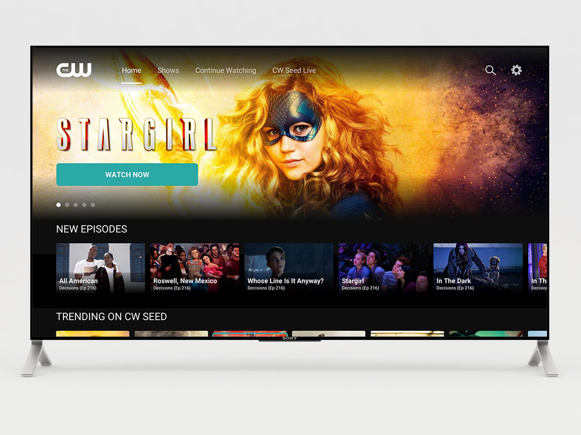
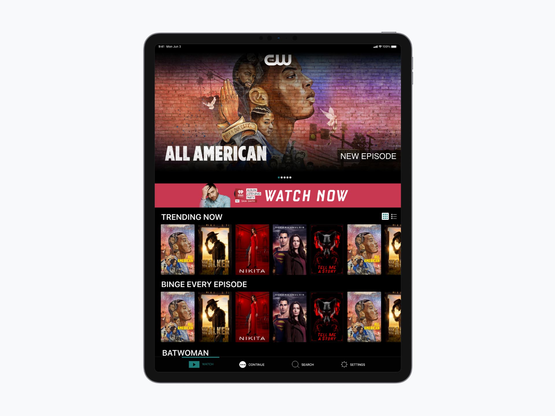
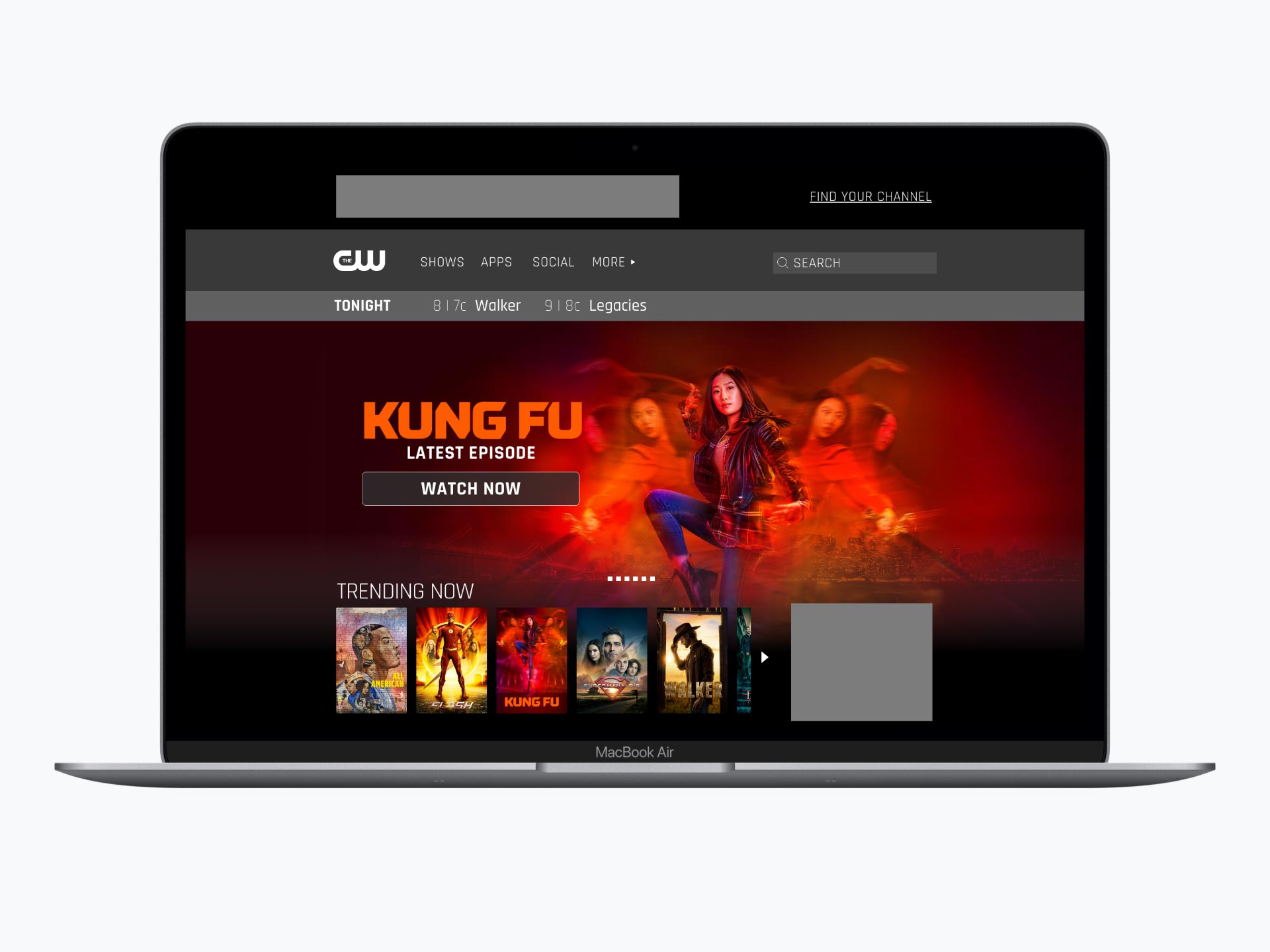
LOOK AND FEEL
Color took a backseat when it came to branding the app. We focused on the shows and the show art. Making sure the art was the main focus. Recognition of actors/actresses and superheros was something we had to make sure drove the experience. Finding your favorite show was easy if you just looked for the art.
IX EXPLORATION
THE LAUNCH

An increase in more binge watching as recommendations of binge shows appear in broadcast shows and longer watch time overall. An increase of people using and watching shows in the app increased from 2-15mins to 2-30mins on average.
Reach Out!
2025 © Edition